The Artistic Rewards of Taco Bell Overindulgence.

The Mayor

I recently completed a fairly magnificent portrait of someone who eats at a Taco Bell somewhere in Ohio so often that they became the ‘Mayor’ of that Taco Bell on Four Square. It was quite possibly my finest moment.Taco Bell just posted a YouTube video of the subject being presented with her likeness as part of her Very Special Day. And here, for your edification, is a remarkable screenshot of that very moment.The Moment
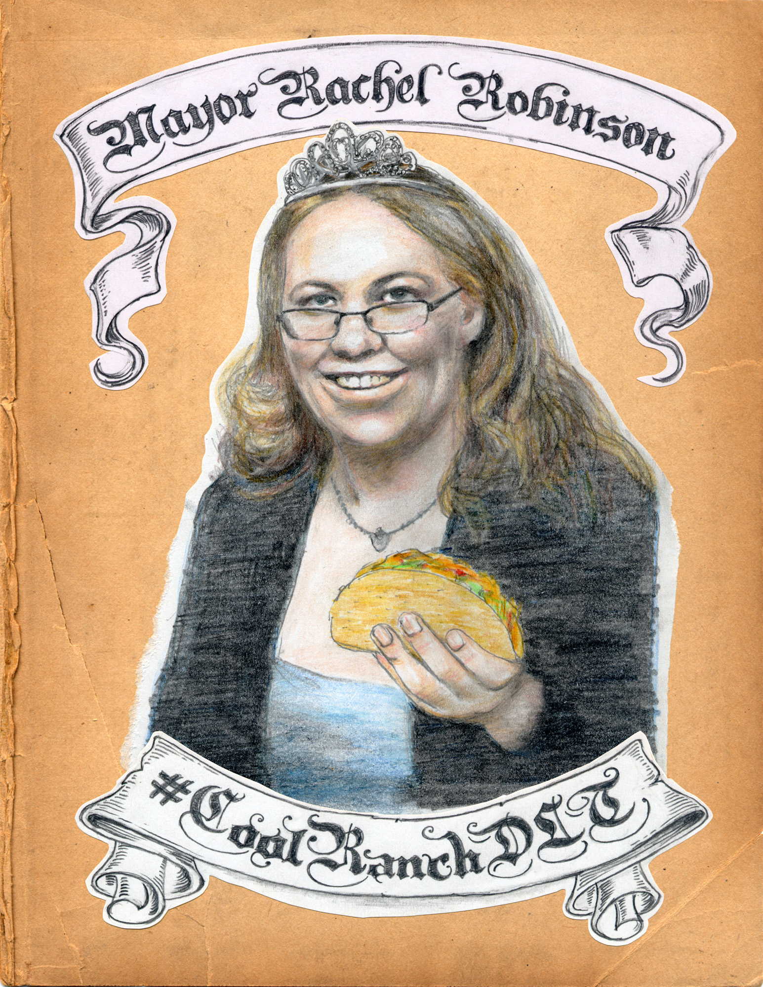
Not only that my friends, but if you have  one minute and thirty-five seconds of your life to spare, you can witness the whole remarkable debacle unfolding before your very eyes right here:[youtube=http://www.youtube.com/watch?v=1X9jVFPksgI]

Presidential Losers.

This portrait of Hubert H Humphrey is now appearing at the Salvage Vanguard Theater Gallery in Austin, Texas as part of the ‘Presidential Losers’ exhibition.The show opened this weekend and is being held in conjunction with Gnap! Theatre Projects upcoming 44 Plays for 44 Presidents stage production which will be opening at the Theatre on October 5th. The exhibition features 75 portraits, one of every contender who has lost the U.S. Presidential Election.My subject of my portrait, Hubert Humphrey, lost the the 1968 election to that that delightful character Richard Nixon. Humphrey was Lyndon Johnson’s Vice President at the time, and “Hubert who?” was allegedly Johnson’s response when, because he was unable to attend Winston Churchill’s funeral, an advisor suggested he send Hubert along as his representative. Humphrey did not attend the funeral. The other quote is from HHH himself, and seemed appropriate considering the forgettable outcome of his Presidential ambitions.

A little bit country, a little bit immunology research genius.

 I Just completed this illustration for an article entitled Jim Allison's Long and Winding Road which will appear in the upcoming issue of UC Berkeley's California Magazine.

To cut a long, and extremely scientific story short, the aforementioned Mr Allison, the subject of both article and illustration, discovered a protein called CTLA-4 in his Berkeley lab way back in 1993.  This protein attaches to T cells and acts as a brake for the immune systems, something that seemed to be of little interest to the majority of the scientific community at the time. But because he is a very smart man Jim understood the significance of this discovery, and went on to develop an antibody to the protein – a drug to block its action.  His theory being that if the new drug did its job, it would free up the immune system to identify and attack cancerous cells, even those that have resisted chemotherapy.

Unfortunately for Jim this new drug then had to enter clinical trials - which went on and on and on and...well you get the picture. The good news is that after 15 years and clinical trials involving 6,500 patients the drug is finally available to treat melanoma. And it offers a completely different approach to cancer treatment that has been proving extremely effective.

All which makes for a fascinating tale, but was bit tricky to translate into in an interesting illustrated portrait. Luckily for me there was a 'human angle'.  Because as well as being a scientific super-hero, Jim was also a South Texan, harmonica playing, country music aficionado.

And so the Cancer Immunotherapy Clinical Trial Blues was born.

Printed Matter.

I've been making my my dubious presence felt in a few otherwise worthwhile publications recently. First up is Issue 2 of InPrint magazine, who's theme is 'typography'.  Aside from the fact that I have a bunch of stuff in it, it's well worth checking out if you're interested in typography and design. It's also available as free PDF download, so you really have no excuse not to, other than your understandable apathy.The next publication is Portals Zine - the lavishly produced, 44 page, saddle-stiched 'Art Journals' issue to be specific. You'll have to pay for this one I'm afraid, but needless to say it's well worth every penny of the $20 in question, featuring as it does the only four page, full-color interview with Yours Truly in existence. Want to know what inspires me, or where I create? Then choke up the twenty bucks right here, my friend. You won't be disappointed. Well, you may be, but please don't complain to me if you are. I got no money for this and did my best to appear at least partially interesting.Now let us continue our jaunty amble through this leafy literate alleyway until we alight upon the estimable Rückenkälte zine. This, as the teutonic title would suggest, is a Germanic publication. It features both short-stories (mostly in German, nor surprisingly) and, for the amusement of non-German speakers, illustrations. Apparently artists such as Mariana Abasolo, Mitch Blunt and David Shrigley have contributed to past issues (although out of that trio Shrigley is the only one I've actually heard of). The theme of the issue I contributed to is "forms" which, as you can see, I interpreted as obtusely as possible.Anyways the good news (or gute nachrichten) for you is that Rückenkälte is a free zine. The bad news (or schlechte nachrichten) for me is that instead of getting paid for my artistic efforts I received a vague and fairly unconvincing promise of  "immense popularity among Germans (and Austrians) for your work". We shall see. We shall see.

Fit To Print.

Two posts in two days! Well, don't say I didn't warn you. The last 48 hours has seen a virtual torrent of online activity unleashed. I've even been tweeting and I uploaded a whole butt-load of last year's drawings and paintings to my Behance page. Soon you'll look back longingly on the days when I would go for weeks, nay months, without a digital utterance.Anyhow, the purpose of this particular rambling update is to vaingloriously brag about a recent illustration commission for the Washington Post. The cover of the Local Living section no less.

The article I was asked to illustrate was about the big differences in the way that men and women exercise - men going berserk lifting weights, generally overdoing it and injuring themselves, and women doing stuff like yoga and pilates and taking it  too easy to actually get much benefit. As well as the cover there was an inside illustration that appeared alongside the article. I thought the humor would come from contrasting the two approaches side by side - so my challenge was to work out a way to do that in both pieces, and tie them together as well. The result was this approach, kind of based on an exquisite corpse drawing, where the picture of the man and the picture of the woman were 'torn' in half and reassembled as one figure, comparing the characteristics of both to comic effect.

As you can no doubt tell I was responsible for hand drawing most of the type too. It was quite a work out.

What the hell happened to 2011?

So we're officially halfway through March 2011 and I have yet to muster a single post. There must be a good reason, right?Well yes, there are several. Procrastination, lameness, avoidance and denial to name but a few. It's hard to remember my personal resolution, made back in January to update this blog more regularly - at least twice a month I vaguely remember muttering to myself as the festivities subsided. I'm not exactly sure why I find this task so daunting, but I am sure I'm sick and tired of starting every post with an apology, so remaining true to my procrastinators heart, my New Year's resolution is officially taking effect in Spring and this post will be the first of a veritable torrent of fascinating information that will forthwith be outpouring from my headquarters here at Fullarton Acres.News? You want news? okay well lets start with two, yes 2 illustrations for the illustrious Utne Reader. The first, below, is already appearing in the current issue, and illustrates an article entitled 'The Art of the Police Report'. It's currently languishing at number one in the 'most read' list on the Utne website (not that I'm letting my handiwork take the credit for that) which means my work is being viewed by literally tens of people! It's actually a fascinating article about how one LAPD patrolman manages to imbue his supposedly subjective police incident reports with a very distinct point of view - worth a read if you have some time to kill.

Next up we feature an illustration that will appear, in satisfyingly linear fashion, in the forthcoming issue of the Utne. This one, which I have only just finished, will be used to illustrate an entertaining little little bio piece about a quirky and charming near-octogenarian who goes by the excellent name of Vernon G. Bandy. Mr Bandy is a Dowser - a man who plies the inscrutable art of finding objects or liquids with a divining rod or stick. Actually where I come from they are known as Diviners, and mostly they spend their time finding water, but apparently old Vern can also locate, with something approaching regularity, just about anything: water (both pure and contaminated), gold, drugs, oil, dead bodies, and snakes. Hence the visual.Astute readers will notice there are no words on this one. You can't say the winds of change never blow through my vast and unimaginably luxurious studio!

Illustrative goings on.

As always I have been remiss on my updates. I have, however, managed to fit a bit of paid illustration work into my hectic procrastination schedule. As well providing me with deep creative fulfillment this allows me to put food on my families plates and a roof over their heads. And it has also allowed my 7 year old son to give up his job as a chimney sweep and return to school.

Here's a couple of the latest efforts. First up, for 'Go', the inflight magazine of AirTran, an illustration for an article about 'Literary Death Matches', which sound fascinating but are really just literary readings with some gimmicky showmanship added to make them slightly less tedious.

Extreme Literary Events are all the rage. Apparently.

Next we have an illustration for an Alumni magazine published by Suffolk University in Boston. This one was for an article in which the author was bemoaning the fact that she had turned in a below par performance as a guest on Oprah's TV chat show. Knowing that she was feeling bad about messing up her 15 minutes of fame, her husband then did what any caring partner would do in those circumstances. He sent her a fake letter, supposedly from Oprah's production company, stating that she would not be welcome back on the Oprah Show because her performance had been so stilted. The author was not pleased.

I laughed. I cried, I drew a picture.

Artwork for Young Offenders 12" vinyl.

12" of limited edition red vinyl fabulousness. I was recently commissioned to do this 12" LP jacket art for San Francisco based 'punk rock sensations' The Young Offenders. Well, actually, my mate Tim is in the band and he asked me to do it in exchange for several flagons of foaming ale, which, I hasten to add, have yet to be forthcoming. Anyhow it turned out nice, so no hard feelings. In case you're wondering, The Young Offenders themselves are no one's idea of young, but they are adequately offensive– procuring a fine approximation of the late 70's British Punk Rock that I'm actually old enough to have experienced first hand. (For anyone who's easily impressed I still have my front row ticket stub for the Buzzcocks supported by Joy Division at the Edinburgh Odeon, 1979.)  The album is available for download on iTunes or, preferably, as a limited edition 12" red vinyl from Deranged Records, complete with beautifully printed, full size, genuine cardboard album cover for a mere $10. The LP labels were hand drawn by yours truly as well, but you only get to see them if you buy the fucker*. Nice ice cream van, mate.*This gratuitously offensive expletive has been included in a pathetically tame attempt to generate an atmosphere of 'Punk Rock' nihilism.

CA Illustration Annual 2010.

Bit late this one, but good news nonetheless, the 2010 Communication Arts Illustration Annual was published in May, and I'm delighted to say I managed to get the above illustration accepted into the 'Institutional' category. Apparently there were over 7000 entries so I'm pretty chuffed to get in. The winning entry is a Holiday card I created for Hang Art, the gallery that represents me in San Francisco. If you have your very own copy of the annual you can gaze upon my triumphant entry in all it's glory on page 176.I just received my very own 'Award of Excellence' certificate in the mail, complete with very shiny gold type, which I will not hesitate to use to impress people who are impressed by such things. They even spelled my name right. Hooray!

Flaming Lips, Timberlake and more name-dropping.

Wayne Coyne and Evil RobotBit of a strange one this.I was the lucky recipient of a feature on JustinTimberlake.com back in July of last year. Then just last month the delightful proprietors of the site got in touch and asked me to create an portrait of Wayne Coyne - the singer bloke from The Flaming Lips - and make a video of myself drawing it.It was an interesting experience, although I must admit there wasn't a lot in the interview to really get my teeth into when it came to coming up with an idea, which explains the Evil Robot quote.  I liked Wayne Coyne's reaction to the question, which unfortunately ended up being deleted, so I'm not sure how much sense the whole thing makes now.Anyway the post is up now on the website as the visual component of an interview with the aforementioned Mr Coyne.  It's a bit of a 'mash-up' with LA based artist SA Richard butting in every so often with his Big Painting. And to be honest it all seems a bit long to me.Here's the whole damn thing, regardless. Consider yourself warned.[youtube=http://www.youtube.com/watch?v=JL45VXIhILg&feature=player_embedded]

Official Merch.

Late last year I was contacted by merchandising company BlueQ about using some of my artwork on one of their stainless steel water bottles. They chose the 'Unbeknownst to you I have been keeping score all along' piece that had appeared in my Sisyphus Office installation, and asked me to re-do it to fit the bottle shape.I have to admit it seemed like a peculiar thing to stick on a water bottle, but who am I to argue with a crack team of hip marketing experts. Maybe dehydrated stalkers and obsessives are a big target market. Anyway the BlueQ people were an absolute pleasure to deal with, and they just sent me a load of bottles, which look fantastic - even if I do say so myself.This remarkable receptacle is now for sale online and at pointless trinket stores everywhere. Not only do I get paid a tiny amount anytime someone's foolish enough to buy one, but 1% of the sale goes to support the conservation work of The Nature Conservancy. For those who care about such details, the bottle is 20oz./600ml, BPA free, no liner, 18/8 stainless steel and decorated with lead-free inks, all of which are good things, I'm sure. So all that remains is for you to buy one. Now. And yes, I will be keeping score.Cheers.

Busy.

Firstly let me apologize for the complete lack of recent updates. This is not, as you may suspect, because there's been nothing happening, but because I've been too damn busy. And I am also apparently incapable of doing more than one thing at a time. Multi-tasking? Not for me, my friends.First up - just did a big illustration job for Razorfish here in San Francisco. FEED is Razorfish’s annual study charting how technology is changing the way consumers engage with brands and I was the lucky bugger who was chosen to provide pictures (with words on them, of course) to illustrate the report's findings and provide a bit of humor. You can learn more about the report itself right here.And here are a couple of the illustrations from the report.

Right before the Razorfish job I was working on another illustration assignment, this time for ad agency Publicis Indianapolis and their client Learn More Indiana. This involved designing, illustrating and hand lettering a campaign of posters aimed at High School students who are about to graduate in an attempt to persuade them to continue their education. Publicis supplied me with the copy and I put the whole thing together working with one of the agency's Art Directors. Here are a pair of examples of what the end result looked like:

Lotsl more examples of the work I did for both of these projects can be seen right here.